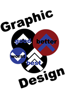
This is about graphic design poster to advertise that designs could be good, better, best or worst. Good designs happen when everything is done right, better designs there are more graphics and designs are better, best the designs are getting best each time you com back and work on it, worst they hardly did anything with it.
Graphic Design is tilted because it gives a visual of being slanted. The arrows represent how projects could get good, better, best or worst. Good projects are done on time with an arrow pointing up. Better projects are done before they are do, red circle with two arrows pointing up, best projects are done on time and before they are do, three arrows pointing up. Worst projects look bad and not good for the client, arrow pointing down.
Click here to view a Halloween animation